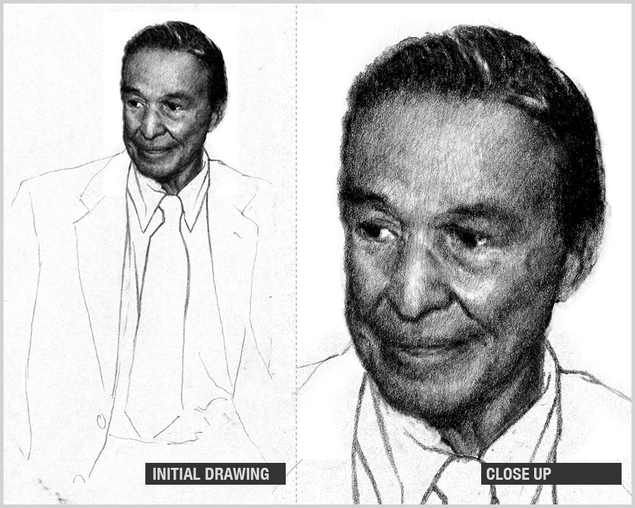
Although each project runs the gamut, the constant factor lies within traditional core foundations. Everything I create begins its life either as a drawing, a painting or both. This then becomes the groundwork for the computer.
On that note, I must insist to point out that there is a certain amount of care involved when working with a computer. There is a fine line that is easily crossed where the computer can become more than a tool, and consume the sincerity and integrity of the work. Many beginners tend to make this mistake, using filters and canned effects to facilitate their needs. Avoid this as much as possible. Also, I highly recommend using a Wacom tablet. If you have the means, an Intuos 3 is an amazing tool; but the Graphire is also a good choice if you want to be more economical. I use a Graphire… (ehh..for now :))
Each one of these portraits were done under 24-hour period. I was given the assignment at 9 a.m. and had until 6 p.m. to finish and upload via FTP to the printer’s server. It was a little nerve racking but it was a good challenge.
Rendering the drawing well is important because it sets the values throughout the process. This allows me to concentrate more on color because the drawing if done correctly keeps the values honest.
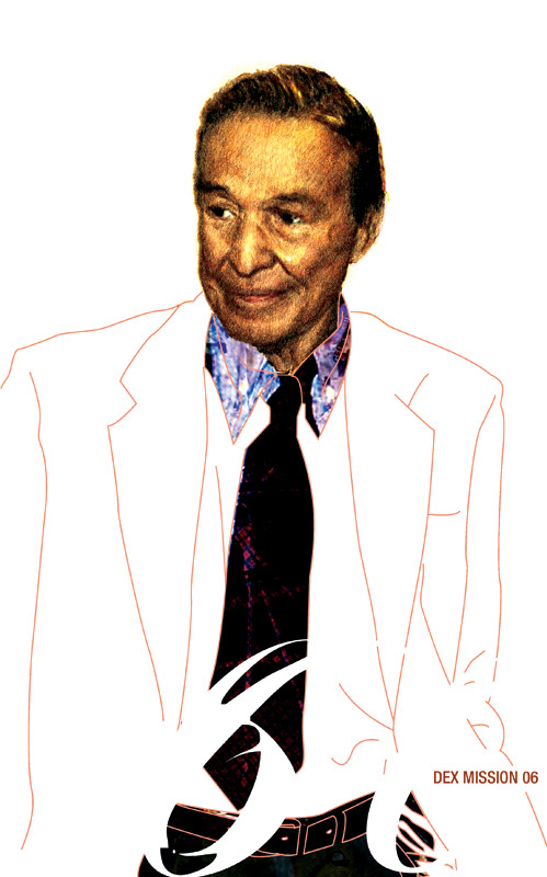
The image is scanned and colored in Photoshop. I use stock brushes with the opacity set to 10-50 percent depending on how solid I want the color to be applied. I build up the color slowly but surely, getting more and more opaque as I work until it evolves to my liking (this is very similar to traditional oil painting). I then finish it off Mr. Mike Wallace by tracing specific outlines using a vector program like Illustrator to get the crisp and clean edges.
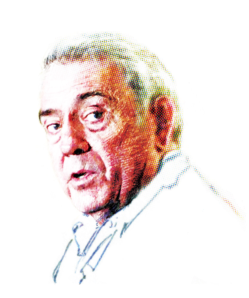 This is Dan Rather
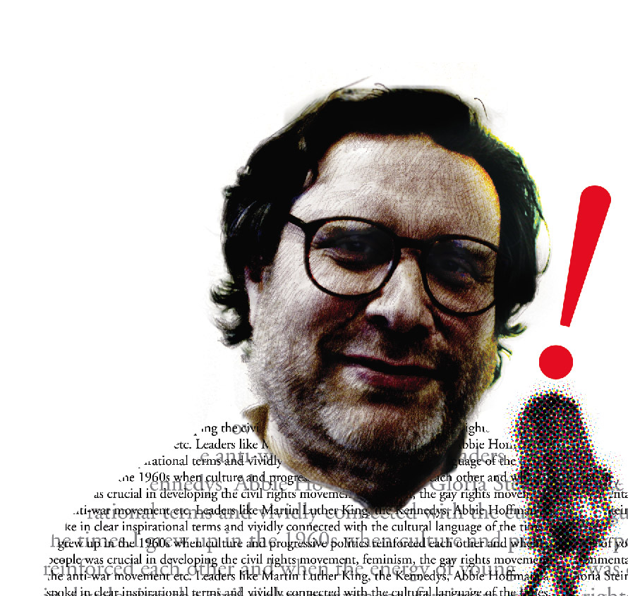 And this one is Danny Goldberg
5 comments:
Thanks so much for sharing information about your process. I find all the layers facinating. I love the Danny Goldberg drawing. The text really sets it off!
great portraits !!!
i'm sooo happy you are back ;-))))
I really like that tanned and highly finished face against the simple lines of the jacket. I'm amazed you get so little time to come up with something like this!
Hey dex, thanks for the heads up! I came over as soon as I could :p It's great seeing how things come together. I like the Danny Goldberg one very much, it's very lifelike and warm. Eye-catching too, something I imagine a journal would commission.
"There is a fine line that is easily crossed where the computer can become more than a tool, and consume the sincerity and integrity of the work." - I wholeheartedly agree. It's easy to let Photoshop do the shadowing for you, or just build up something pretty with blocks of colour and the Pen tool, but you're effectively robbing yourself of the practice needed to learn how light falls, how to combine colours in real-life, how to draw a GOOD line the first time instead of being able to Ctrl-Z and go back all the time.
Just curious, how have you been fitting in artwork with your day-job work? Are you taking classes at the moment?
Thanks so much for letting us peek into your world/work,
Angie
These are wonderiffic!!
Post a Comment